The Challenge
Despite their technical credibility and longstanding reputation, MEPS’ visual identity hadn’t evolved in line with their global ambitions. The existing brand no longer reflected their role as a forward-thinking, digital-first insight provider. As they sought to sharpen their competitive edge and appeal to a wider, more international audience, a full visual rebrand was required.
The brief was clear: the new brand needed to be modern, recognisable, and flexible across digital and physical applications, from social media and reports to exhibitions and large-format signage. Importantly, it needed to maintain a link to the company’s Sheffield roots and engineering origins, while presenting MEPS as a global leader in data, forecasting, and market intelligence.
What We Did
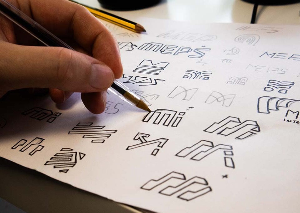
The project began with an in-depth discovery session, engaging senior stakeholders at MEPS to uncover the company’s core values, ambitions, and audiences. This process gave us a clear view of how the brand needed to evolve, not just aesthetically, but strategically. We mapped out existing brand perceptions, explored competitor positioning, and worked to define how MEPS could express its authority, integrity, and modern outlook through visual language.
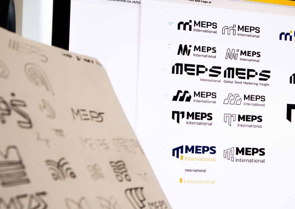
At the heart of the rebrand was a new logo and emblem, inspired by the Bessemer Converter, a symbol of Sheffield’s industrial legacy and transformative innovation in steel production. By referencing this iconic piece of engineering, we ensured the new identity stayed connected to MEPS' origins, while the clean, geometric lines and bold forms brought a contemporary edge.
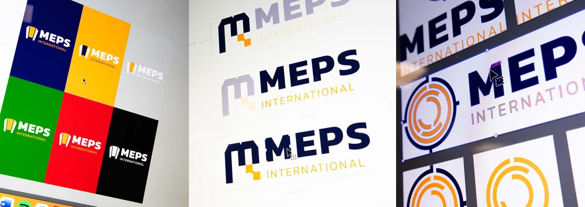
The final logo reflects both legacy and progress: instantly recognisable, grounded in heritage, but forward-facing in execution. Its versatility was central to our design strategy, allowing seamless use across digital platforms, mobile devices, print documents, and large-scale physical signage.
Once the logo was established, we developed a comprehensive set of brand guidelines, including refined colour palettes, typography systems, iconography, and visual rules for digital and print use. These guidelines provided MEPS with a consistent framework for applying the new brand across every channel, empowering their in-house team while ensuring long-term coherence.
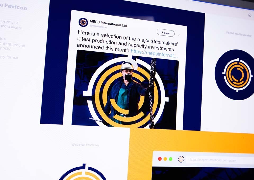
To support the launch of the new brand, we designed a suite of marketing materials including business cards, social media templates, exhibition displays, document templates, and sales collateral. These assets were created to be both visually consistent and practical, balancing impact with clarity, especially when communicating complex data sets to international audiences.
We maintained regular collaboration with MEPS throughout the process, via both virtual meetings and in-person catch-ups. This allowed for close alignment, transparency, and a strong sense of shared ownership over the final creative direction.
The Result
The rebrand has successfully repositioned MEPS International as a modern, professional, and globally respected voice in steel market intelligence, without losing sight of the company’s Sheffield roots. The new visual identity captures the essence of their evolution: from a small, specialist consultancy to a globally trusted authority that continues to grow in reach and influence.
The Bessemer Converter-inspired logo acts as a visual anchor, reinforcing the brand’s connection to steelmaking while communicating structure, precision, and trust. This strong emblem now appears on exhibition banners, business stationery, reports, and digital content, creating consistency and recognition across every customer touchpoint.
The rollout of the brand has extended into the physical world with banners displayed proudly at football stadiums, a large-scale logo installation overlooking one of Sheffield’s busiest arterial roads, and signage on the company’s building that has quickly become a staple of recognition for the MEPS name.
Internally, the refreshed identity has instilled pride and provided a framework for future communications, while externally, it has elevated perceptions of MEPS as a leader in its field. The visual transformation has also laid the foundation for future marketing and digital development, giving the company the tools to communicate confidently in an increasingly competitive and globalised marketplace.
By combining thoughtful strategy with creative execution, this rebrand demonstrates the power of sympathetic design: one that respects the past, embraces the present, and paves the way for what’s next.

Awards & Accreditations
Recognition